below is raw code, not edited and poorly commented. Working on manuscript now so will be updating this blog post.
FORMATTING DATA (code to run models below)
code to run rmark known fate models
|
|
|
below is raw code, not edited and poorly commented. Working on manuscript now so will be updating this blog post. FORMATTING DATA (code to run models below)
code to run rmark known fate models
0 Comments
Use adehbabitatHR to calculate and plot home ranges in R, export a table of those home ranges, calculate summary statistics, and then plot them in R using leaflet. This code is based on the awesome tutorial by James Patterson, with some of my own modifications.See his tutorial here: https://jamesepaterson.github.io/jamespatersonblog/03_trackingworkshop_homeranges 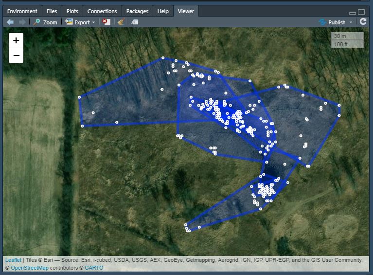 Here is the R code I used to make a Gannt chart displaying a muli-taxa wildlife monitoring timeline with different survey types. It's based on the code from: https://www.molecularecologist.com/2019/01/simple-gantt-charts-in-r-with-ggplot2-and-the-tidyverse/. My main modification is the overlapping colors to display two techniques used to monitor the same taxa at the same time. 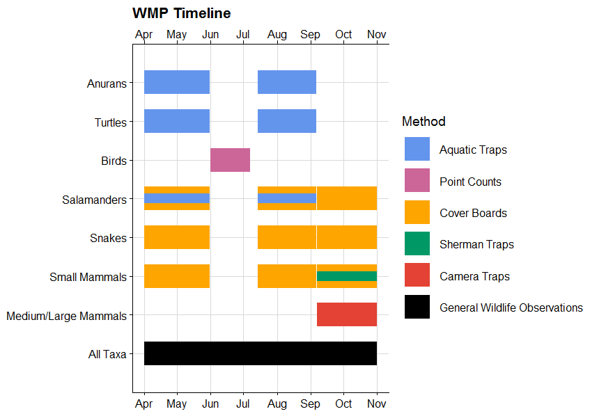 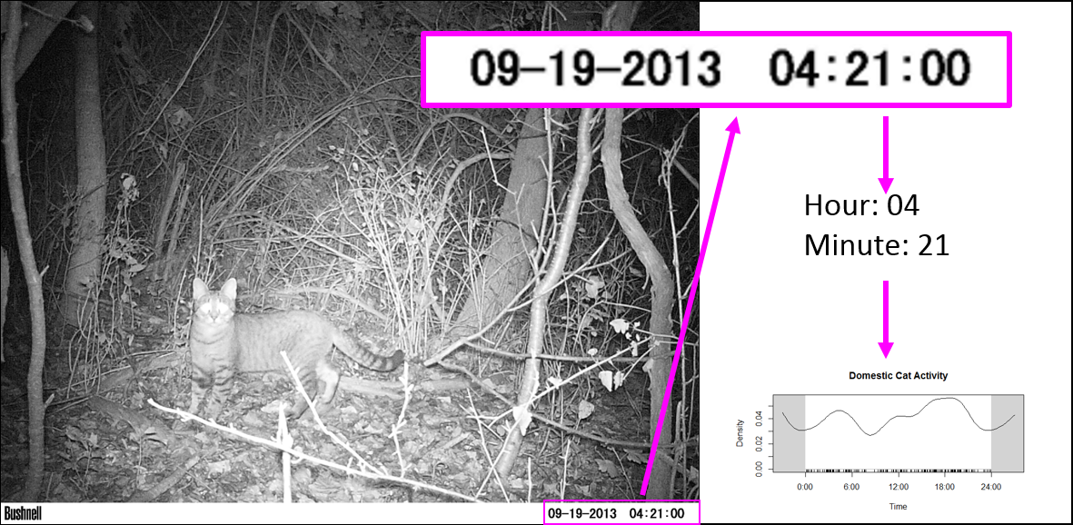 Sorting through thousands (or hundreds of thousands) of camera trap photos is time consuming. Some tools exist to make this process easier, such as camtrapR (https://cran.r-project.org/web/packages/camtrapR/index.html), which can automatically extract relevant metadata (e.g. the time the photo was taken) from the individual image files. However, metadata can be fickle, and in the case of time, this can easily be corrupted if the files have been moved or copied. In my case, I wanted the time data so I could examine the activity periods of mesocarnivores inhabiting suburban preserves. So, instead of manually entering the time data for thousands of images, I developed this R script to save me some time and reduce the rate of transcription errors. That said, I’m a field biologist and not a professional coder, so this code isn’t perfectly efficient or universal, and you’ll need to modify it to suit your individual needs. These are the essential commands, in case you don't want to read the whole thing: magick::image_read() magick::image_crop() tesseract::ocr_data() Now for everyone else, before you start, make sure you have the following packages installed: tesseract magick lubridate tidyverse exifr tesseract does the OCR (optical character recognition). In other words, this is the package that converts the time stamp on the image to text that we can then analyze instead of typing it in manually. magick is used to manipulate the image files and get them ready for the OCR. lubridate is a package that makes working with dates and times much easier than base R. tidyverse is a quick way to load a bunch of different packages that I use frequently, such as stringr (working with character strings), dplyr (data manipulation), and ggplot2 (graphing). exifr is a package that extracts metadata from image files. For this package, you need another programming language installed on your computer, “Perl”. See https://github.com/paleolimbot/exifr for easy to follow instructions. I went with Strawberry Perl (http://strawberryperl.com/) as I have a Windows machine. Ok, first load your libraries: Code Editor
For this example, I’m just working with domestic cat images. The images from the long-term dataset I’m working with are saved in a folder called MammalImages, which then has an individual folder for each year of data collection (2008–2018), and then a folder for each individual camera location (n = 259). When the images were initially sorted, the file name included the code of the animal (e.g. DOCA for domestic cat). This next chunk of code uses the exifr package to scan through the MammalImages folder (and all subfolders) and pull out the file path and camera model from only the images with DOCA in their file name. The camera model part will come into play a bit later. Note that the “tags” argument is different than then “pattern” argument. Pattern is part of the list.files function and is where you include your search terms. “tags” is from the read_exif function and is used to include which metadata (EXIF) data categories you want to extract. Depending on how many files you have, this will take a bit. In my case, it took about 2 minutes to find 326 images in a folder containing 172 gigabytes of images. Code Editor
Next, I want to extract the file name from the file path (e.g the previous folder information), as well as the camera location (in my case, this is the wildlife monitoring point; WMP) and the year the data was collected. I also create a new empty column that we will fill in the next step. Here’s an example of what the “sourcefile” looks like, so you can see what I’m pulling out: F:/WMP_MammalImages//2008/LAK-L-113/N4_DOCA(1)_0017.JPG I now want to copy the images to a new folder, because you NEVER want to mess with the original files. Basically, I create a copy of each original files in a new location but give each one a better (more informative) name. You can skip the renaming step if your files already have informative names, but mine don’t (e.g N4_DOCA(1)_0017.JPG). Note: Be careful renaming files, as you can permanently mess up your data. I would recommend doing this on data you have already backed up (because you’re already doing that, RIGHT?)! Ok, so what the hell was all that? Well, I utilized a “for loop”, iterating through the data by a variable I’m calling “row”, which refers to the maximum number of rows in my data (so, 1 to 324). Then, I use stringr:str_c to create a string of what I want each new file to be using paste to combine the year, WMP, row, and “DOCA”. Thus, the above code: ### Create new name for copied images CAT2[row, 6] <- stringr::str_c(CAT2[row, 5], CAT2[row, 4], row, # add the row number "DOCA", sep = "_") would result in 2008_LAK-L-113_1_DOCA (much better than N4_DOCA(1)_0017!). In my data, column 6 was NEW_FILE, column 5 was YEAR, column 4 was WMP (the syntax for subseting data using brackets is [row, column]). Then, I used the paste function to tell file.rename which file we were renaming, and what to change it to. Paste works similarly to str_c. Once the loop is done, all my cat images are together in one folder, with a new name that is more informative than the old name. Note 1: I could have called “row” anything, like “puppy” or “covfefe.” But row seemed intuitive. Note 2: I could have simply typed in 324 (the number of rows) instead of using the nrow function, but nrow gives flexibility as this number isn’t always the same (like if I wanted to use this code to analyze my coyote images). Note 3: This can take some time, so I initially created a smaller subset of my data to practice on while making sure the code worked as intended. For example: CAT_TEST <- dplyr::slice(CAT, 1:5). I would recommend you do this, too. Note 4: People hate for loops. An alternative might be the map() function from the purrr package. Alrighty, now that the images are organized in one folder, we can start the image processing! First, I want to get all the file names together so I can rename them (again) using the date and time data extracted directly from the photo (not the metadata). Then, load the image into the R environment, and then (within a for loop), crop each image to the date/time stamp, use OCR to extract the text, save the text, and rename the file using this new data. Visually, here are the steps to loading, cropping, and extracting: CAT_IMAGE <- magick::image_read(F:/WMP_MammalImages//2018/SIN-B-103/DOCA6.JPG) # import image CAT_IMAGE #view image 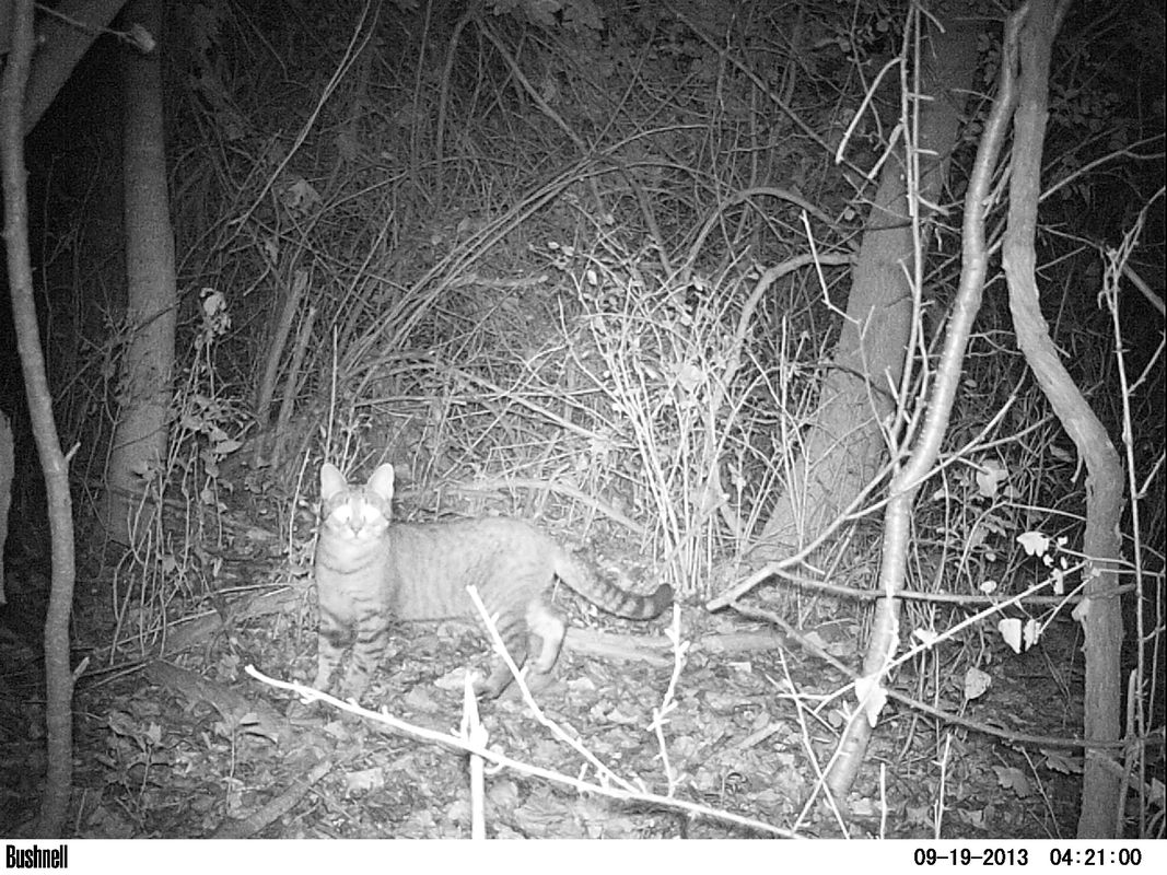 CAT_IMAGE2 <- magick::image_crop(image = CAT_IMAGE, geometry = "774x96+2490+2352") #crop image CAT_IMAGE2 #view image  DATE_TIME <- tesseract::ocr_data(CAT_IMAGE2) # ocr the cropped image DATE_TIME #view the OCR'd text 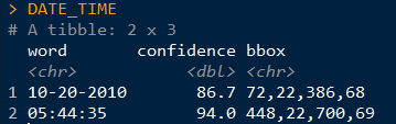 Thus, we can then extract the time and date from the DATE_TIME object. The order will depend on how your image strip looks. For the magick::image_crop command, the numbers "726x98+2490+2352" are the coordinates, in pixels, of the boundary I want to crop. This will depend on your photos. To get this number, I opened one of my photos in the free program IrfanView (https://www.irfanview.com/), and simply held my left mouse button down to draw a selection box around the area I was interested in. Then, I simply took the coordinates it displays at the top of the window and applied them to the format: Width x height + x offset + y offset In other words, crop out a box of width 726 and height 98, starting at 2535 pixels from the right and 2360 pixels from the top. You can get the pixel dimensions how ever you want, but that’s how I did it. 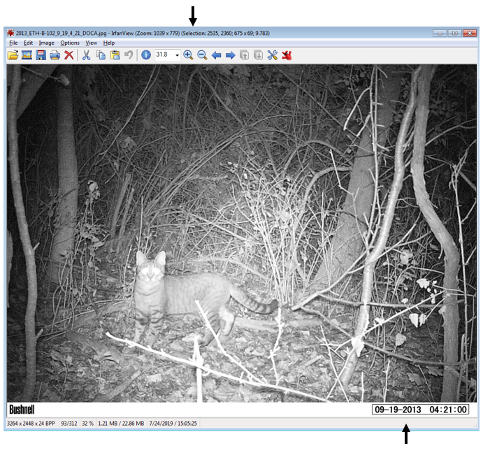 Now, here’s the code wrapped in a loop. Remember when I initially mentioned saving the camera brand? Well, we used three different types of cameras over the 10 years. The different types of cameras have different time strips, so they require different coordinates for cropping. So, the following code only apples to my Bushnell images, which was the overwhelming majority of photos. I simply moved the other cameras to a different folder and modified the code to OCR them. Don’t forget that last closing swiggly bracket, or the loop won’t work! Note: The final line, cat("image renamed","\n\n"), is just to tell R to print the words “image renamed" followed by line breaks. I don’t know why \n means line break, but I assume it is a holdover from earlier years of programming. Also, the cat function doesn’t mean a feline, it is short for concatenate. This actually messed me up as I was switching the code over to analyze my coyote data, as I used search and replace to change all instances of CAT to COYOTE. Well, that wound up breaking my entire loop and took me 15 minutes to figure out because it changed cat("image renamed","\n\n") to coyote(“image renamed","\n\n")! Whoops... Finally, you’ll want to save all the work you just did. To do so, I use this code: write.table(CAT4, "clipboard-100000", row.names = F, sep = "\t") That takes all the OCR data, now saved in CAT4, puts it on the clipboard without row names, and let’s you paste it into excel. There are plenty of ways you could do this, but this is how I did it. If your data set is huge, and you get an error message, you can increase the number after clipboard-. That’s it, hope you learned something! Feel free to ask questions or advice for making the code better, leave it in the comments or hit me up on Twitter at @wild_ecology. Below is a link to the code in entirety so you can just copy and paste it as you see fit. Finally, thanks to Andrew Durso of the blog Snakes are Long (http://snakesarelong.blogspot.com/) and Neil Saunders (@neilfws) for the suggestion that tesseract might help to solve this problem. PS: Here's the cat activity graph that I originally needed the data for: 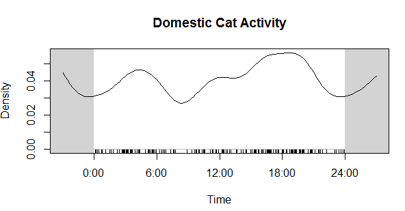 Now compare that to the coyote data. Much different! Cats in our preserves don't seem to be be noctural, diurnal, or crepuscular, whereas coyotes are decidedly nocturnal, as expected. 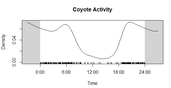
In 2006, Jeffrey Row and Gabriel Blouin-Demers published a Copeia paper boldly titled “Kernels Are Not Accurate Estimators of Home-range Size for Herpetofauna.” This tutorials based on some code I created to follow their advice in my own studies. In addition, the code below will help you learn to create minimum convex polygons and kernel densitiy estimates in R, even if you don't plan to create a custum smoothing value. MCPs and KDEs can also be used for other anlyses outside of home range analysis, but the methods here work regardless of your intended purpose. The package adehabitatHR is the go-to package for home range analysis in R. This is a newer and more specialized version of the old adehabitat. Commands are in blue, comments in pink followed by a #, and output in blockquotes or images. library(adehabitatHR) #load package Go ahead and load your tracking data. If you use the file choose () command, note that the popup box is often minimized, so you have to look for it. You can call it whatever you want, but I called mine “all.telemetry.” My data is setup so that I have three columns: Snake ID, Easting, and Northing. The Easting and Northing are my GPS coordinates in UTM format. Because my snakes have IDs and not names, I turn their values into categories. Here’s what my data looks like (with real numbers instead of xxxx): all.telemetry <- read.csv(file.choose()) #load all telemetry data for H. plat all.telemetry$SnakeID <- as.factor(all.telemetry$SnakeID) #turn first column into categorical data head(all.telemetry) SnakeID Easting Northing Because I suck at R, let’s look at each snake individually. Maybe as I get better I’ll figure out how to do this for the entire dataset, but for now, we will select a single snake (Snake 1) to analyze. The double = tells R to only include rows with a value of 1 in the first column. (2019 update: I no longer suck at R, but who has time to update old code? This still works, it's just not as efficient or pretty as it could be... so it goes). s1<- subset(all.telemetry,SnakeID==1) #only look at Snake #1's data Next, we use the SpatialPoints command from adehabitatHR to turn the easting and northing data into actual GPS coordinates. Remember that functions (commands) in R are case sensitive. The [2:3] tells R to apply the SpatialPoints function only to the second and third columns. s1xy<- SpatialPoints(s1[2:3]) #turn the xy data into coordinates Now we will calculate the 100% minimum convex polygon, used to represent the home range of the snake. $area is needed to pull out actual value. mcp(s1xy, percent = 100) #view all the mcp data object of class "SpatialPolygonsDataframe" package (sp): mcp(s1xy, percent = 100)$area #extract just the mcp area [1] 10.41575 Now we can save this value to use later. s1_homerange <- mcp(s1xy,percent=100)$area #save the 100% minimum convex polygon value as a variable Ok, so now let's view the MCP. We graph the home range of Snake 1, and then add the radio-telemetry locations on top. The pch argument tells R to plot the radio-telemetry locations as circles, and cex controls how big they are. add=TRUE tells R to put the circles on top of the figure that is currently being displayed. plot(mcp(s1xy,percent=100)) #graph the 100% mcp plot(s1xy,pch=1,cex=.75,add=TRUE) #add the data points on top 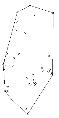 So we now have the MCP, and we visualized it to make sure there were no mistakes. Let’s make a utilization distribution (kernel), setting the smoothing factor to “href.” This is actually the default option, so you can leave the h=”href” part out if you want to. Once you create the UD, you can view it in raster form (yuck) with image(ud). ud <- kernelUD(s1xy,h="href") #calculate and save the utilization distribution  Now we will get something we actually care about, the 95% UD/kernel density. To do that, we can use the getverticeshr command. Why does the most important function have such an unintuitive name? Who knows. The kernel.area command isn’t needed for what we are doing, but it’s nice info to have, so I like to include it. ud <- kernelUD(s1xy,h="href") #calculate and save the utilization distribution ver <- getverticeshr(ud,percent=95)$area #find and save the 95% utilization distribution kern <- kernel.area(ud, percent = seq(20, 95, by = 5)) #find and save the ud for 20 - 95% ver #view the 95% ud area kern #view the areas for the 20% ud up to the 95% ud by increments of 5 I don’t know about your data, but the href method basically doubles the home range estimate for my snakes. My Snake 1 has a 100% MCP of 10.3, and a 95% UD of 23.4… it’s almost as if Row and Blouin-Demers were onto something… Anyway, let’s visualize everything. Note how the 95% UD (red polygon) looks a lot like the yellow heat signature in the raster image from earlier (that's no coincidence). plot(getverticeshr(ud,percent=95)) #graph the 95% kernel to the plot plot(getverticeshr(ud,percent=50),col="red",add=TRUE) #add the 50% kernel to the plot plot(mcp(s1xy,percent=100),add=T) #add the 100% mcp to the plot plot(s1xy,cex=.75,pch=1,add=TRUE) #add the gps points 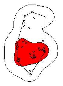 Up until now, we haven’t actually addressed the point of this blog, the h value. How do we get the H value? We pull it from the results of the kernelUD function, which we named ud. If you try to get it by typing in ud, you get nothing ostensibly useful. If you try ud$h, and you literally get nothing. However, ud@h gives you a list containing the value of h, and the method used to calculate it. We want to use the h value later, so we pull it out and store it as a vector. You need to include the use.names=F, or it also includes an h, and we can’t do math with a dumb letter tagging along. The [1] indicates we only want the first item in the list. 2019 update: a lot of these "weird" steps now make a lot of sense as I've advanced as a programer, but I'm going to leave up my colorful laguage because I'm sure new programers can relate to my past frustration! h <- unlist(ud@h[1],use.names=F) #find the smoothing factor from the utilization distribution h #view the smoothing parameter 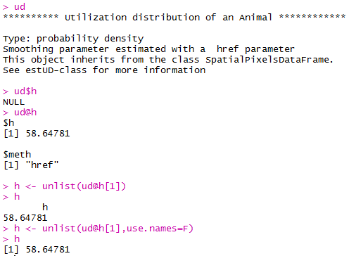 The following part is clunky, and there is probably a better way to do it. In fact, I figured out a better way to do it while I was not day dreaming in class on Tuesday, but then I forgot. So it goes. Basically, we create a matrix, turn it into a data frame, and give the columns names. I’m pretty sure you can just create the data frame without creating a matrix first and give it column names, all in one line of code, so maybe I’ll fix this in the future. 2019 update: I haven't had to use this code recently, but I now think the which() command would be more useful and save a lot of time and effort. output <- matrix(ncol=2, nrow=h) #create a matrix to fill with home range and smoothing factor values output <- data.frame(output) #turn it into a dataframe colnames(output) <- c("h","hr") #add column names Ok, I’m pretty proud of the following code. It’s a simple loop, but it’s my loop and I love it. It starts by creating a vector called ud_loop, which is the kernelUD function again, but instead of using the href smoothing method, it calculates the ud with the number 1 and stores it in the dataframe we created. Then, it populates the second column of the dataframe with the area of the 95% UD. The loop does this until it calculates the 95% UD with a smoothing factor equal to that used by the href method. Some notes on the code: tryCatch is used to keep the code from stopping if an error or NA pops out; this will happen for certain small values of h. getverticeshr calculates the 95% UD by default, which is why we didn’t specify it. Finally, the +s are used when code wraps to the next line. 2019 update: I'm not longer very proud of this clunky code, but I am proud of the creativity that went into it. for (i in 1:h) { #start the loop to find smoothing factor values + ud_loop <- tryCatch(kernelUD(s1xy,h=i),error=function(err) NA) #trycatch allows loop to progress despite NAs + output[i,1]=i #fill first column in dataframe + output[i,2]=tryCatch(getverticeshr(ud_loop)$area,error=function(err) NA) #fill second column in dataframe + } #end loop plot(output,type="l",lwd=2) #graph of home range against smoothing factor abline(s1_homerange,0) #add a line at the 100% mcp homerange value hvalue <- locator(n=1)$x #physically click on the intersection between the two lines on the graph, which saves the smoothing factor value associated with the 100% mcp 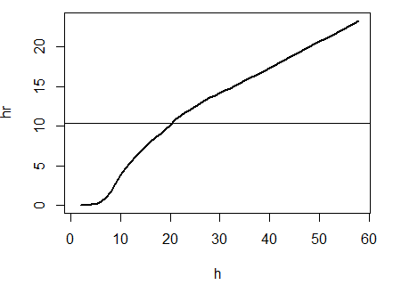 hvalue #print the smoothing factor [1] 20.3 And there you have it! You can now plug that smoothing value back into the UD command. As you can see, the using the custum smoothing value gives you a 95% kernel that is the same size (or aprox the same size) as the 100% MCP. Note that the output below looks different because I changed the visual settings for Rstudio. This is purely aesthetic. ud2 <- kernelUD(s1xy,h=hvalue) #calculate the new utilization distribution ver2<-getverticeshr(ud2,percent=95)$area #find the new 95% utilization distirbution s1_homerange #print the mcp estimate from earlier ver2 #print the new 95% ud kern2 <- kernel.area(ud2, percent = seq(20, 95, by = 5)) #view the new uds for 20 - 95% kern2 #print the uds 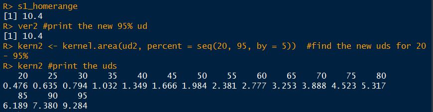 Finally, let's visualize what we've now done: plot(getverticeshr(ud2,percent=95)) #view the new 95% kernel plot(getverticeshr(ud2,percent=50),col="red",add=TRUE) #add the new 50% kernel to the plot plot(mcp(s1xy,percent=100),add=T) #add the 100% mcp plot(s1xy,cex=1,pch=21,col="white",add=TRUE) 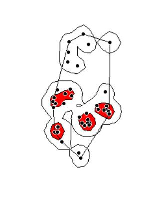 As you can see, the new 50% and 95% UDs are much different than the original 50% HD based on the default href values. These may be similar to or more conservative than your original UD values, but by using this method the results are somewhat more reproducible and likely to be more biologically relevant. Of course, this will also depending on sample size and other factors.
Anyway, hope you enjoyed! Let me know if I can clarify anything or you have any other questions. Cheers! library(tidycensus)
library(tidyverse) #need to use current development version library(ggrepel) #need to use current development version census_api_key("enter your api key here", install = TRUE, overwrite = TRUE) readRenviron("~/.Renviron") v15 <- load_variables(2016, "acs5", cache = TRUE) vt <- get_acs(geography = "county",variables = c(medincome = "B19013_001")) vt <-subset(vt,GEOID < 72001) pos <- position_jitter(height = 120, seed = 1) vt %>% ggplot(aes(x = estimate, y = reorder(NAME, estimate))) + geom_point( shape = 21, size = 4, fill = "white", stroke = 1, position = pos ) + labs(title = "Median Household Income by County", subtitle = "2012-2016 American Community Survey, n = 3,137", y = NULL, x = NULL) + theme_classic() + theme(axis.text.y = element_blank(), axis.ticks.y = element_blank()) + geom_text_repel(data = subset(vt, NAME == "Lake County, Illinois" | NAME == "DeKalb County, Illinois"), nudge_y = -500, nudge_x = 20000, aes(label = NAME))+ geom_text_repel(data = subset(vt, NAME == "McCreary County, Kentucky"), nudge_y = 500, nudge_x = 200, aes(label = NAME))+ geom_text_repel(data = subset(vt, NAME == "Loudoun County, Virginia"), nudge_y = -1000, nudge_x = -500, aes(label = NAME)) + geom_point( shape = 21, size = 4, stroke = 1, fill = "white", position = pos ) + geom_point( data = subset(vt, NAME == "Lake County, Illinois"), shape = 21, size = 6, fill = "red", stroke = 1, position = pos ) + scale_y_discrete(expand = c(.05, .05)) + theme(axis.text.x = element_text(size = 12, colour = "black")) + theme(plot.subtitle = element_text(size = 18, colour = "black"), plot.title = element_text(size = 24)) ggsave( "median income figure.png", height = 9, width = 16, units = "in", dpi = 300) https://www.nature.com/articles/sdata2017123 AbstractCurrent ecological and evolutionary research are increasingly moving from species- to trait-based approaches because traits provide a stronger link to organism’s function and fitness. Trait databases covering a large number of species are becoming available, but such data remains scarce for certain groups. Amphibians are among the most diverse vertebrate groups on Earth, and constitute an abundant component of major terrestrial and freshwater ecosystems. They are also facing rapid population declines worldwide, which is likely to affect trait composition in local communities, thereby impacting ecosystem processes and services. In this context, we introduce AmphiBIO, a comprehensive database of natural history traits for amphibians worldwide. The database releases information on 17 traits related to ecology, morphology and reproduction features of amphibians. We compiled data from more than 1,500 literature sources, and for more than 6,500 species of all orders (Anura, Caudata and Gymnophiona), 61 families and 531 genera. This database has the potential to allow unprecedented large-scale analyses in ecology, evolution, and conservation of amphibians. Oliveira, B. F., São-Pedro, V. A., Santos-Barrera, G., Penone, C., & Costa, G. C. figshare https://doi.org/10.6084/m9.figshare.4644424 (2017) #download data from https://doi.org/10.6084/m9.figshare.4644424 #Load package, change to your destination library(tidyverse) # if tidyverse isn't installed, run this: install.packages("tidyverse") #Load package, change to your destination AmphiBIO_v1 <- read.csv("C:/Users/John/Google Drive/AmphiBIO_v1.csv") #select species AnFo <-filter(AmphiBIO_v1,Species=="Anaxyrus fowleri") AnAm <-filter(AmphiBIO_v1,Species=="Anaxyrus americanus") AnTe <-filter(AmphiBIO_v1,Species=="Anaxyrus terrestris") LiCa <-filter(AmphiBIO_v1,Species=="Lithobates catesbianus") LiCl <-filter(AmphiBIO_v1,Species=="Lithobates clamitans") LiPi <-filter(AmphiBIO_v1,Species=="Lithobates pipiens") LiSp <-filter(AmphiBIO_v1,Species=="Lithobates sphenocephalus") LiPa <-filter(AmphiBIO_v1,Species=="Lithobates palustris") LiSy <-filter(AmphiBIO_v1,Species=="Lithobates sylvaticus") ScHo <-filter(AmphiBIO_v1,Species=="Scaphiopus holbrookii") #group species into a dataframe prey_frogs <- bind_rows(AnFo,AnAm,AnTe,LiCa,LiCl,LiPi,LiSp,ScHo,LiSy,LiPa) #limit columns to those interested in prey_frogs <- transmute(prey_frogs, Species=Species, Body_mass_g = Body_mass_g, Body_length_mm = Body_size_mm) #view dataframe prey_frogs I'll be updating this over time. Feel free to comment and tell me if there is something to add or fix.
Formatting
This is just a post to keep my thoughts together, and so that I have a place to review what I did in case (when) I forget. 1) reviewed how to use arcmap's model builder on youtube. 2) created a model in model builder to streamline workflow 3) model doesn't work 3) realized model isn't working because it's still processing. It was taking forever to run because my 10m resolution landcover shapefile is massive (1.91 gb) 4) decided to clip landcover .shp to the largest extent I need (a 300m buffer around points). This took ~45 minutes to run, but reduced file size to 63 mb, a 97% reduction. 5) reviewed changes suggested by editor for paper submitted to The Kingbird while clipping processed 6) tested model, model worked 7) added iterative function to model so I can run it once instead of separately for each buffer (20, 100, 164, 300). 8) model successful! Using a model instead of doing everything individually was not only a time saver, but a huge mental energy saver. In the image below, yellow box is a geoprocessing function. That's three per buffer, so after creating the model, I used one click to to 12 separate functions, and about 120 mouse clicks and brain decisions (or things that could be messed up). AUTOMATE! 9) use select by attributes to copy forest cover (gridcode=1) into excel (site and obs covarites.xlsx) 10) use vlookup to fill in column of all potential sites 11) transform into proportion of buffer by dividing by the area of the buffer (a=π*r^2) 12) do this for each of the 4 buffer zones 13) then I dicked around for a bit because I'm weak, but then all the while pondering my next step 14) decided to modify my model for the buckthorn layer I have, which is 5m resolution and county level 15) it two three easy steps and less than a minute to modify my model to use the buckthorn layer as its input, and name the output files accordingly. Taking the time to create this model has now saved me an additional 12 geoprocessing function steps. AUTOMATE! 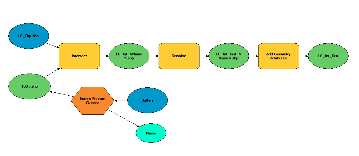 The model 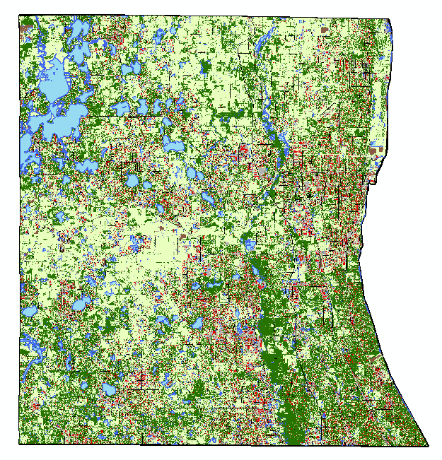 Almost 2 gigs of landcover data at 10m resolution! 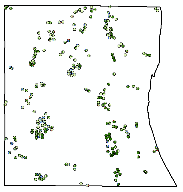 The data I actually need... 234 points buffered by 300m. Much more manageable. 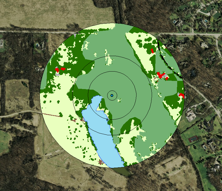 Landcover and buckthorn. "Forest" is dark green, "buckthorn" is pale green. |
|||
